Effective Typography for your web design projects
Typography can make or break your design be it a web design, logo design, or any other media that incorporates text. Good typography not only makes the user read but also feel. It allows the user to focus on the content, it affects how your message is understood and perceived, it can set the personality of your product, and most importantly improve the user's experience.
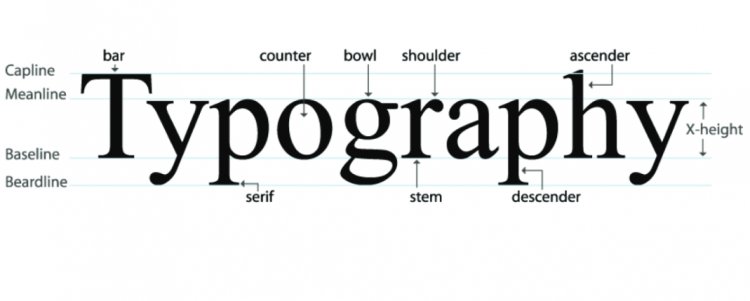
Typography can make or break your design be it a web design, logo design, or any other media that incorporates text. Good typography not only makes the user read but also feel. It allows the user to focus on the content, it affects how your message is understood and perceived, it can set the personality of your product, and most importantly improve the user's experience.
“The magic happens when it works invisibly while making your design legible and visually satisfying.” -unknown
Talk about make or break, here's an example of bad kerning on billboards.


Here are 5 tips I personally use when working on my typography.
1. Choosing the correct typeface.
Specifically speaking, choosing the typeface for your body text, It will help determine the decisions of any other typeface that you are going to use for your design. Why? Because body text is the most common element of your design. The look and feel of your body text will have the greatest impact on the typographic quality of your design.
There are a ton of sites where you can find free and paid fonts, but the most efficient site I use is fonts.google.com, not only does it come with a ton of free fonts, it also comes with the “Popular pairings” suggestion.
Pro tip: After selecting a font scroll down to the very bottom of the page, there you can find the “popular pairings” section. It is very useful if you are not sure which font pairing will look good.

2. Balance line spacing and point size
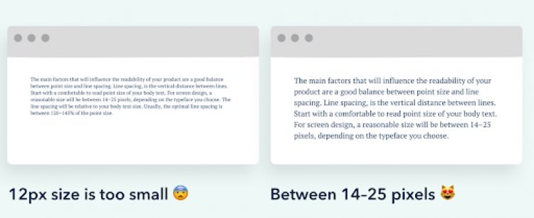
Line spacing is the vertical distance between lines. Start with a comfortable to read point size of your body text. For screen design, a reasonable size will be between 14-25 pixels, depending on the typeface you choose. The line spacing will be relative to your body text size. Usually, the optimal line spacing is between 120-145% of the point size.
3. Watch your line length
Line length is the horizontal distance of a block of text, long lines a commonly design problems of the web.

The ideal line length should be 45 characters to 90 characters including spaces. Shorter lines will make a big difference in the legibility of your design, since they’re more comfortable to read the longer lines. As line length increases, the reader’s eye becomes fatigued, and it makes it harder to track their progress.
4. The Use of the ‘Golden Ratio’
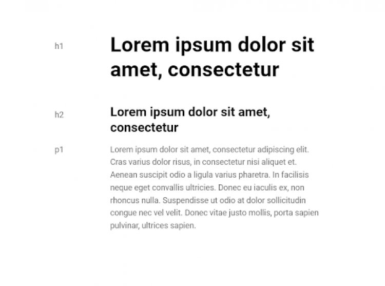
If you are in this profession long enough you might have stumbled upon the term golden ratio, divine proportion, the number 1.618. Yes, it has been used to come up with cool and effective layouts for web design, but it does not end there. You can also use the golden ratio 1.618 to come up with the sizing for your Header text and Body text.
P1 : 14 * 1.618 = (H2) 22.652 * 1.618 = H1 36.650 … and so on
Pro tip: when considering font weights always scale up 2x, meaning having a regular p1 you should have your h2 on Bold, this creates variations on your typography
5. Have fun and trust your gut
Probably the most important advice I could give you, is to always remember to have fun and trust your gut, because by the end of the day nothing matters but the sense of accomplishment of producing your best work and that can only be attained if you love what you do. :D


